Imagine this guy showing up at your office for a job interview. It’s likely your judgment filter would kick in in less than 30 seconds, and you will conclude the applicant is severely out of touch and may have been living in a cave for the last 30 years.
Not a good first impression.
This week I was working with a trade association that has engaged me to speak to 5 of their chapters in 2014 on branding. During our negotiations, I mentioned to my contact that the trade association’s current logo needed a facelift. In addition to the logo mark being too busy, a major part of the design was the state of Florida.
Lose the “So last decade” logos.
Yikes! Someone call the brand police, Using the state as art is passé, just like a blue leisure.
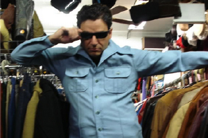
The light blue leisure suit is a great metaphor for branding that is outdated and reflects a tired or should be retired elements.
Sure light blue leisure suits had their hay day. Along with fax machines and the Sony Walkman. But unless you a putting together an exhibit at a history museum, they need to go away and be replaced with something current.
Design styles change just like fashion. Is your logo or look and feel of your brand communications relevant and in tune with the times.
Even if your brand image is nostalgic or classic, it’s important to make sure it’s still relevant.
Beyond logo marks and the look and feel of a brand, here are two other areas where those light blue leisure suits can pop their ugly heads.
Update your sad office décor.
Last month I gave a speech to a design and construction company. They worked on a lot of cool projects. Their work was creative and modern, yet their office was filled with light blue leisure suits.
Their décor was full of way ugly and old furniture, hanging plants that were popular in the 70’s and art that did not support their brand essence.
The next one I was recently guilty of.
Upgrade the tired technology.
Until last month, I was using an old iphone. One of my clients called me out. Karen, what’s up with the antique phone. He was right, my choice of equipment was dated and not consistent with my image as a progressive and relevant branding authority.
Touch points like your logo, office décor and even the equipment you use should represent you are, not who you were in another life.
This week audit your top touch points.
Your web site
Your office
Your wardrobe
Your brand identity, logo, look and feel of materials
Your business cards
Your social media image
Spot a light blue leisure suit? You know what to do.